In iPadOS 15, Apple is making another round of changes to iPad multitasking. It would be easy to consider this yet another spin on the merry-go-round as Apple struggles to figure out how to break the iPad out of the iPhone’s fundamental one-app-at-a-time interface.
But I don’t. Instead, I think Apple is finally assembling all the pieces of the puzzle that will allow the iPad to become more Mac-like than ever before—all the while retaining its unique position in Apple’s ecosystem.
Is Apple waiting for the right moment to unveil proper external-display support on the iPad, perhaps alongside the release of a new Apple display? I’m not saying it will definitely happen, but I want to believe. So let’s look at the evidence.
A window into the future
Apple has been flirting with the idea of putting floating windows on the iPad for a few years now. For example, Slide Over is a floating window attached to one side of the screen. Picture in Picture floats above apps but must be placed in a corner. Two years ago, Apple introduced the concept of multiple app windows—but they were really just multiple instances of an app, running in existing app frames. (A Microsoft Word file in full screen and a different Word file in a different Split View, for example.)
But with iPadOS 15, things are getting more interesting on the windowing front. Yes, the iPad’s new Globe-key shortcuts seem to point to more sophisticated multitasking to come, but what really caught my eye is a more old-fashioned Command-key shortcut that Apple has imported from the Mac: next App Window, executed by holding down Command and the tick-mark (`) key.

Apple
This is the Mac’s “cycle through windows” keyboard shortcut that became a part of my muscle memory in the early days of Mac OS X, and I still use it all the time. On iPadOS 15, pressing Globe-tick will move focus among different visible apps when in Split View and Slide Over, so you can choose which app will receive keyboard input. Pressing Command-tick cycles through multiple windows within a single app.
Add to that the introduction of the iPad’s newest interface element, the Shelf, a visual representation of an app’s currently open windows. This feels like Apple adding complexity in order to add clarity, and I’m not entirely sold on it conceptually. Regardless, the Shelf’s very existence shows that Apple is trying to find ways to make multi-window interfaces in iPad apps discoverable and usable.
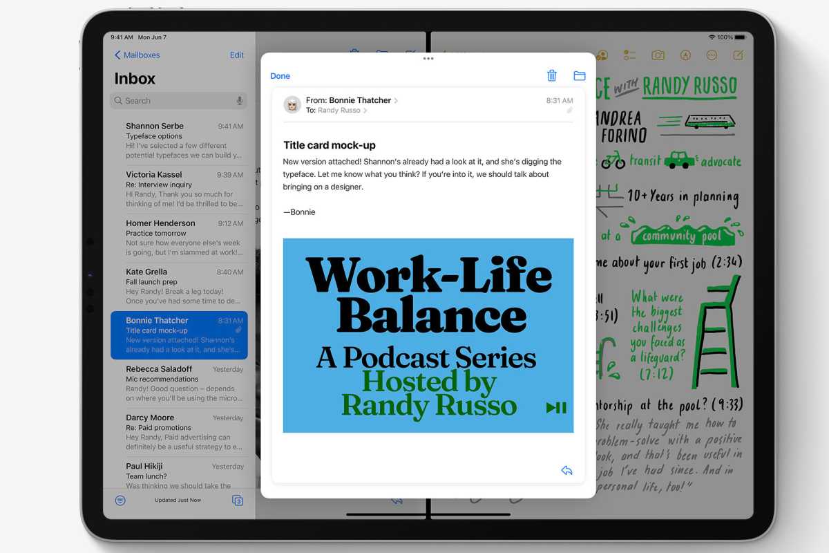
And then there are iPadOS 15’s new additions to the growing family of iPad windows. First off, there’s the new “floating center window,” which appears (among other places) when you create a new message in Mail. It’s a window that initially appears hovering above the app that spawned it, but it’s got Apple’s new three-dot windowing interface at the top that will let you drag it around (hmm, I wonder why would you need a drag area for iPad windows?), or move it to its own full screen, Split View, or Slide Over location.

Apple
What separates the floating center window from just being a window from a Mac app? Only iPadOS acting as a policeman, limiting where you can place it. Otherwise, it’s a floating window of the kind Mac users have known for decades.
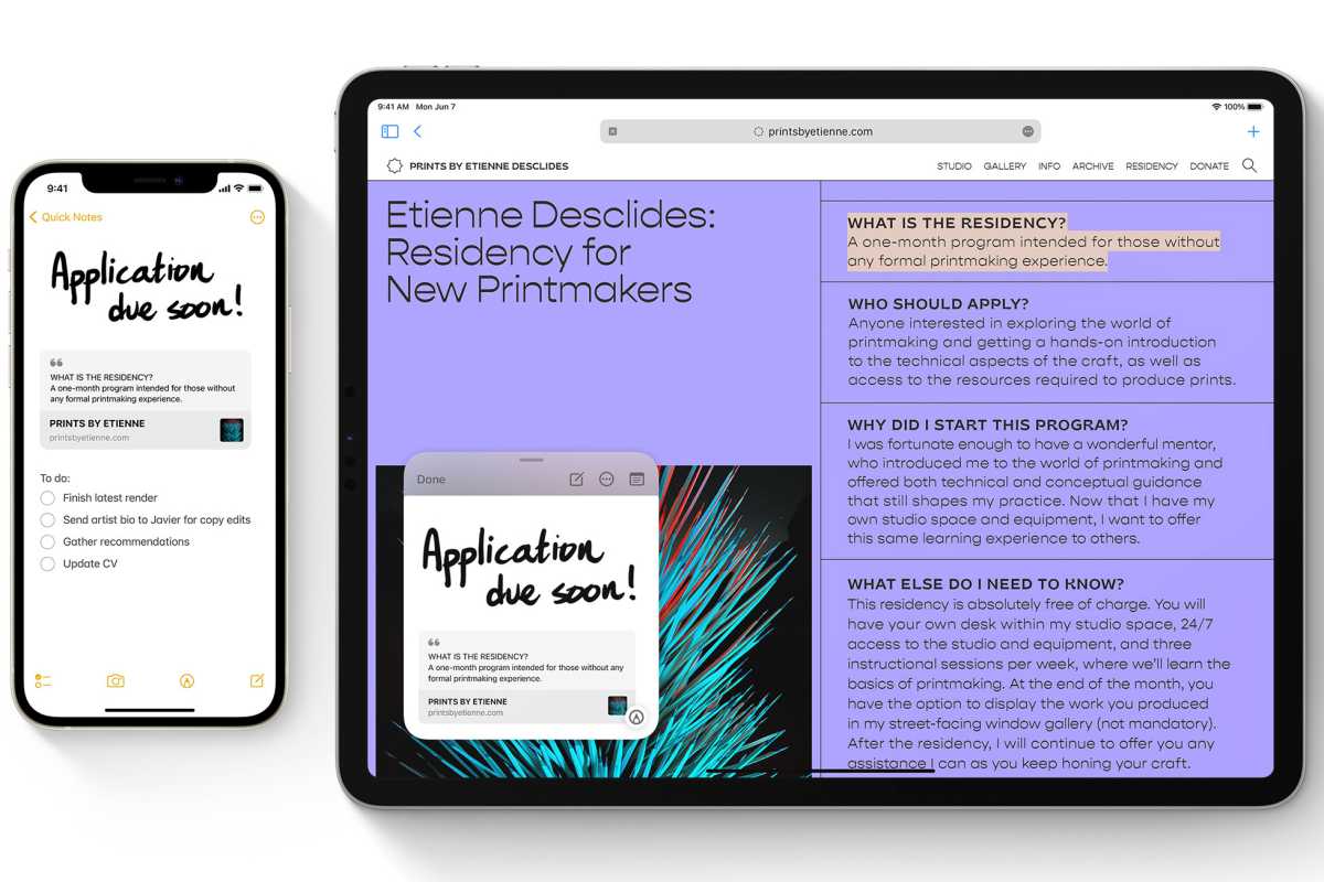
Which brings us to Quick Note, a new feature coming to iPad, iPhone, and Mac this fall that is implemented in iPadOS as… a floating window. Yes, it behaves like a Picture in Picture window–you can only place it in the corners, or you can park it off the side of the screen with a translucent arrow widget indicating that it’s ready to be resurfaced.
Even if you discount all the other evidence that Apple is building a foundation for free windowing on the iPad, it’s extremely hard to look at Quick Note and believe anything else. It’s an independent floating window layered above other apps. Windowing on the iPad isn’t just inevitable. It’s already here.
Apps of all shapes and sizes
One of the biggest arguments against offering Mac-style windowing on the iPad is that iPad (and iPhone) apps aren’t built to be infinitely resizeable like Mac windows are.
There’s truth in that, though it’s not true as it once was. Modern iOS apps have to adapt to numerous screen sizes and orientations. And once again, the Mac shows the way: If you use an iOS app on an M1 Mac, you’ll see that they’re resizable—with limits.
I doubt that any iPad windowing scheme would offer pixel-perfect resizing of the sort the Mac offers. But imagine resizing a window and having it snap to a bunch of different aspect ratios and sizes—corresponding to the dimensions of various supported Apple devices.
iOS apps can be chameleons. I think I’d actually prefer to run the iPhone layout of some apps on my iPad. Some apps are a bit ridiculous on a 12.9-inch display, but quite delightful when displayed in the compact frame of an iPhone 12 mini.
It’s got menus, bar optional
It’s not just windows. Apple is also rebuilding the Mac menu bar on the iPad, and it’s doing it in plain sight. Hold down the Globe or Command keys in iPadOS 15, and you’ll see an overlay that lists all the available keyboard shortcuts—organized in a quite familiar pattern that begins with File and Edit. You don’t even need to use keyboard shortcuts–tapping on any command will execute it.

Apple
How are there hidden menus inside iPad apps? The answer lies with Catalyst, which enables iPad app developers to bring their apps over to the Mac. Now iPadOS 15 makes that extra work visible on the iPad, too. (Catalyst apps can also open multiple windows, and on the Mac they appear as regular, floating independent windows. Hmm.)
Would Apple ever offer a proper Mac-style menu bar on the iPad? I think it might, in the proper contexts. Perhaps only when a keyboard and pointing device are attached, or only on an external display that has to be entirely driven by those input methods. But (as my fever dream of a 5K iPad mock-up shows), it’s not as if the iPad isn’t already most of the way there. The iPad’s status bar displays time, date, and a bunch of icons already–they’d be at home in a Mac-style menu bar. Toss in icons for Control Center and Notification Center if you want.
Not now, but soon
All the pieces are there: a proper mouse-driven pointer, multiple windows per app, menu bar items, and apps that can adjust to different sizes. It’s not hard to imagine, using almost entirely existing iPad interface elements, what a bunch of different iPad apps floating on a 5K display might look like. That’s what I did—and you can see it at the top of this article.
Would I like to plug my M1 iPad Pro into a 5K external display and see an interface like the one illustrated above? Why, yes. Yes I would. As Apple has repeatedly made clear, what sets the iPad apart from other devices is that it’s supremely adaptable. It can be a naked touch tablet, but you can add an Apple Pencil, a keyboard, or a Magic Keyboard with a trackpad.
Adding a big, bright display and filling it with app windows doesn’t break the premise of the iPad. It fulfills it. I hope Apple sees it that way, too.
Note: When you purchase something after clicking links in our articles, we may earn a small commission. Read our affiliate link policy for more details.

