
My friend John, knowing that I’ve created many charts in Numbers, sent me an interesting example of how Numbers frequently doesn’t behave as you’d expect it to.
Our expectation about how spreadsheets should behave is, of course, molded by the years of dominance of Microsoft Excel. And while Numbers and Excel theoretically occupy the same category of software, Numbers frequently feels like Excel’s quirky counterpart from a parallel universe.
John wanted to create a simple chart based on two columns of data — dates and values.
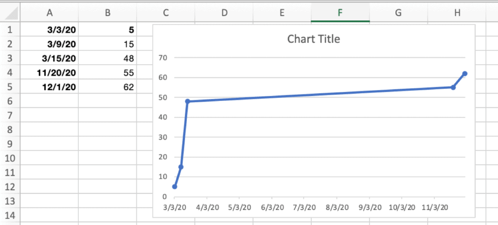
In Excel, this couldn’t be easier. Select the data set, click on the line chart, and you get exactly what you’d expect:

When you do do the same in Numbers, however, you get a very different result:

While Excel was smart enough to realize that the dates should be plotted as the X axis, Numbers just ignores them and plots the values evenly across time, using the dates as labels.
It turns out that Numbers is very aggressive about treating its first row and column as room for labels, rather than data. John made the mistake of putting the date in the gray-shaded first column, and Numbers therefore just assumed they were labels and not to be used for actual charting.
So let’s try this again:
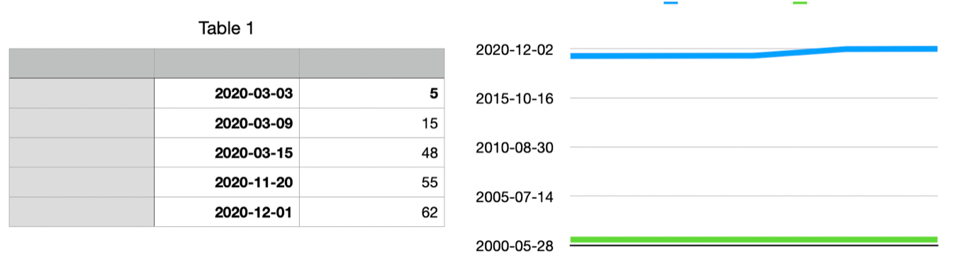
Nope. Now Numbers is trying to chart both columns as data series, which is also not what we want.
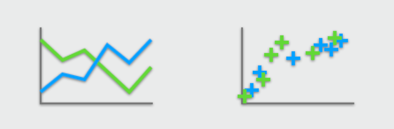
It turns out that the remaining error is that we’ve selected a chart type that looks like the chart we want to generate, a 2D line chart, when what we actually want to use is a 2D scatter chart.
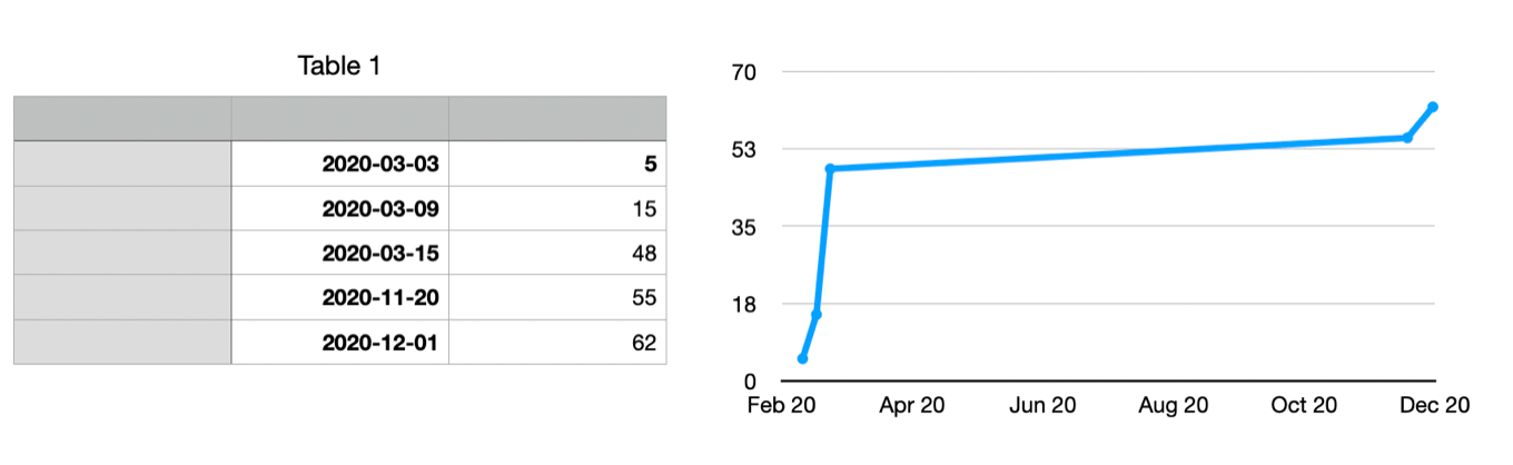
If I select the same data set in Numbers and create a 2D Scatter chart, things are starting to look up:

With 2D Scatter chosen, Numbers does the right thing and treats the dates as X values, and now the data points are in the right spots—even if they don’t look anything like the simple connected dot chart generated by Excel.
But that’s okay. One of the greatest strengths of Numbers is how much control it gives you over chart design. By adding a connection line to the data series and reducing the size of the data symbol, we can replicate the simple Excel chart in Numbers:
Numbers has some basic rules that it follows, and in this case, they failed to lead John to the right solution—and it took me several steps to figure it out. In contrast, Excel has evolved over decades to guess the desires of its users, and knew exactly what my friend wanted to chart.
What can I say? Numbers can do almost anything, but it can be downright weird at times.
If you appreciate articles like this one, support us by becoming a Six Colors subscriber. Subscribers get access to an exclusive podcast, members-only stories, and a special community.